 |
| Easily create modal dialog without using any third-party library |
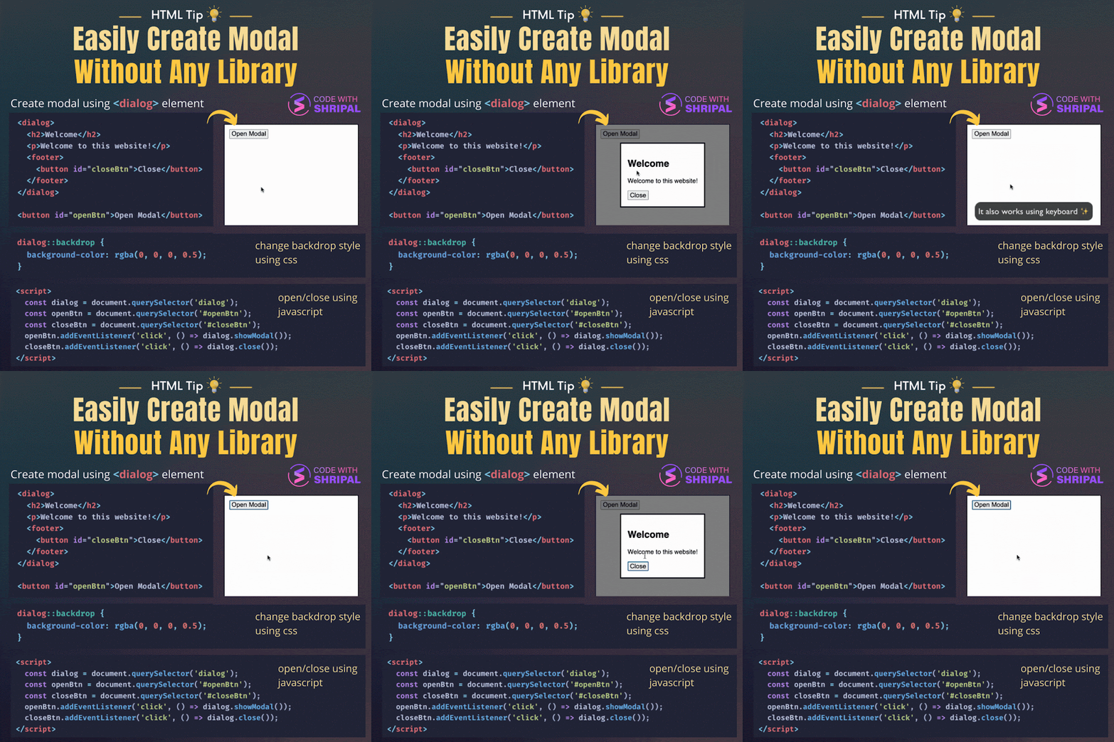
This HTML file demonstrates the use of the <dialog> element to create a modal dialog box.
The dialog box is triggered by clicking the "Open Modal" button and can be closed by clicking the "Close" button inside the dialog box.
The HTML file includes a <button> element with an id of "openBtn", which is used to trigger the dialog box, and a <dialog> element, which contains the content of the dialog box.
The <dialog> element has a <h2> element for the title of the dialog, a <p> element for the body content, and a <footer> element containing a "Close" button. The file also includes a CSS file, "playground-theme.css", which is not shown in the code provided.
The CSS file likely contains styling rules for the dialog box, such as its position, size, and appearance. The JavaScript code at the bottom of the file uses the querySelector method to select the <dialog>, #openBtn, and #closeBtn elements. It adds event listeners to the openBtn and closeBtn elements. When the openBtn element is clicked, the showModal method is called on the dialog element, causing it to be displayed as a modal dialog box.
When the closeBtn element is clicked, the close method is called on the dialog element, causing it to be hidden again.
credit: Shripal Soni

Comments
Post a Comment